Upon learning of the fate of old ratty suspended Professor Mills (whom I'd hoped was long since dead so I could merely say nice things about him without suffering some terrible retaliation), I was immediately struck with curiosity concerning the key players in Mills' suspension.
Though the Provost and the Dean, having risen in the ranks, are well-fortified in their administrative bunkers, with only eight people in the world knowing what they do or why they do it, and with defensive websites repelling invaders with lists of the vicious activities of the "Capital Budget Advisory Committee" and other unspeakable horrors, their lackey professor, Theatre Department Chair Mark Kuntz, is more exposed.
 He's the member of the team on the ground, doing the dirty work. He has to field the complaints, fire them up to his masters, listen to the whining, take the shots, all the while holding office hours, teaching classes, and maintaining an inviting website for students and alums that opens him to satire and ridicule, all while Provost Bodman and Dean Edwards recognize how useful is a turkey once given a title.
Having a looksy through Professor Kuntz's website, I was struck by the design, and how well it goes with his ambiguous memo quotes about "reasonable standards for and by reasonable people" and "ethical violations" and "a learning environment that embraces tolerance, safety, and freedom of speech".
I sent the site to Sean Tejaratchi, an accomplished typographer, asking him for a review of Professor Kuntz's choice of typeface, and he responded thus:
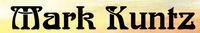
[It] is a common Art Nouveau face. I've seen it under many names, but I knew it first as Arnold Boecklin.
It's the long-term favorite of hippie designers and anyone with a feminine designer locked inside their heart. It's a nice face, but it's painfully overused in certain circles. It suggests a free-thinking soul with vague, feel-good spiritual leanings, and ESPECIALLY someone who's familiar with art school, in the Biblical sense. Just look at Kuntz' site and you'll see how well the font goes next to the unimpeachable serenity of a watercolored sunset.
It's a non-statement masquerading as a statement. It's a very, very safe typeface with no negative connotations. It's hippie-ish, but without the druggy smoke connection of later fonts. It's not the kind of font which would ever be suspended for say...wielding a knife in an irresponsible, stabby manner.
No comments:
Post a Comment